


A 'Font' of Knowledge
Your choice of typeface says a lot about you.

I love Substack. I’m now a grizzled Substack veteran, creeping up on my fifth anniversary of publishing Rule of Three on its platform (yes, of course there will be cake). I’ve never explored utilizing a different option than the default font provided, which I believe is a Google product called “Inter.” There is apparently a way to change fonts, but, I gotta’ be honest, it sounds like a lot of work, and I’m unlikely to invest my time and energy in that effort, as opposed to spending my time researching monkeys, Seinfeld characters and potential Pope names, just three recent Rule of Three column topics which have served to delight and entertain dozens of dedicated readers.
Speaking of fonts (how’s that for a smooth transition?), my Microsoft Word application features a lineup of 229 different options, of which I have deployed perhaps three over the years. It’s not clear to me why there are 229 various fonts available for my use in crafting a letter in Word - I mean, who cares, right? Although, as I consider the issue more thoughtfully, perhaps this array offers an opportunity to customize the message not only through the choice of words, but also through the choice of font.
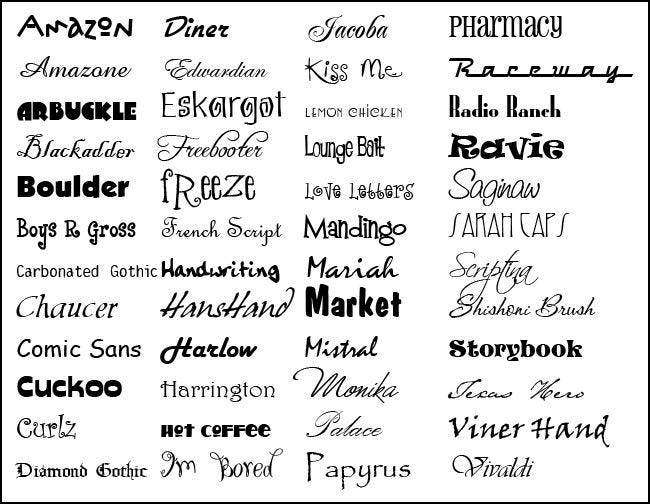
As an example, one of the Word font options is “Vivaldi,” depicted here. . .
I believe this font could be useful in correspondence with symphony orchestra conductors. “Dear Mr. Bernstein: I am writing you in regards to your recent performance of. . .” I would advise you to shy away from a font named “Schoenberg,” if one exists - it simply wouldn’t have the lyrical resonance of Vivaldi.
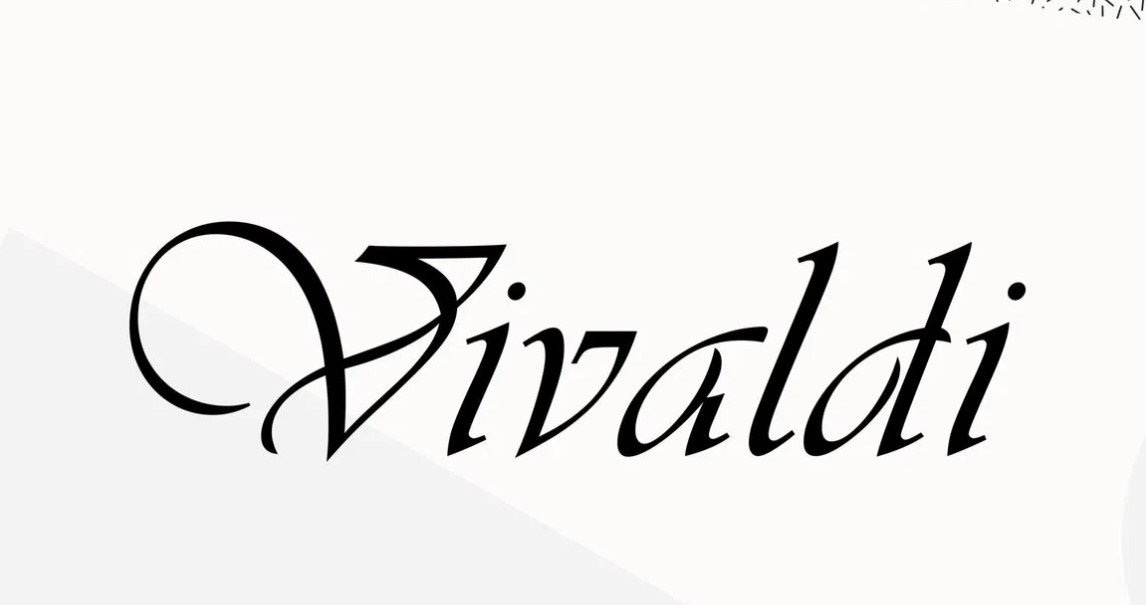
Or, how about “Broadway”. . .
A letter to a Broadway producer, pitching a new musical, might benefit from the use of this particular font. “Dear Mr. Merrick: As you search for new musicals to mount on Broadway, I’d like to share with you a script which I have recently completed. . .” You’re probably best-served to steer clear of “Off-Broadway,” or “Off-Off-Broadway” fonts - these products are typically “quirkier,” and may not be around long.
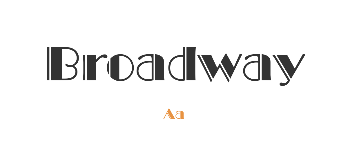
If you’re composing a letter to an old schoolteacher of yours, you might choose “Century Schoolbook.” “Dear Miss Swazey: It’s been many years since I was in your second-grade class at Joseph Sears School, but I wanted to reach out and thank you for. . .” A related font which you might find less useful is “High School Dropout” - your missive to an old schoolteacher of yours might be returned to you, marked up in red ink.
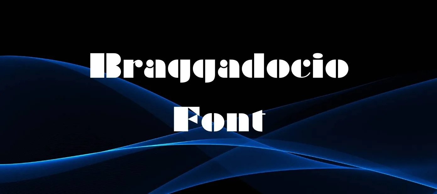
The “Braggadocio” font is appropriate when you are tooting your own horn; Muhammad Ali could have made great use of this font. “Dear Mr. Cosell: Please ensure that in future reporting of my boxing exploits the sobriquet “The Greatest” is always included. . .” You will find the “Humblebrag” font a bit more difficult to master; its tools appear to be straightforward, but often lead to a surprisingly different result.
My Word program reflects twelve variations on the “Bahnschrift” font (depicted here). . .
As you can plainly see, the differences between these twelve fonts is quite stark. In addition to the “plain” option, there are: “Condensed,” “Light,” “Light Condensed,” “Light SemiCondensed,” “SemiBold,” “SemiBold Condensed,” “SemiBold SemiCondensed,” “SemiCondensed,” “SemiLight,” “SemiLight Condensed” and “SemiLight SemiCondensed” options. Are you wondering, as I am, when to turn to one of the Bahnschrift font options? Well, according to adobe.com, “Bahnschrift is a sans serif typeface that looks mechanically drawn and deceptively simple. It is based on the German industrial standard typeface design DIN 1451, which has been used in highway signage and has been widely influential since its introduction in 1931.” So clearly, if one is writing a letter to the German Motor Vehicle Division (“Deutsche Kraftfahrzeugabteilung”), Bahnschrift is the way to go. “Dear Motor Vehicle Professional: While traveling recently on the Bundesautobahn 9 on my way to Berlin, I noticed. . .” As to which of the twelve Bahnschrift font options is most appropriate when crafting this letter, I would argue that it simply does not matter, because there is no discernible difference between them.
Another worthy font available is “Blackadder,” which I believe is also a species of snake. . .
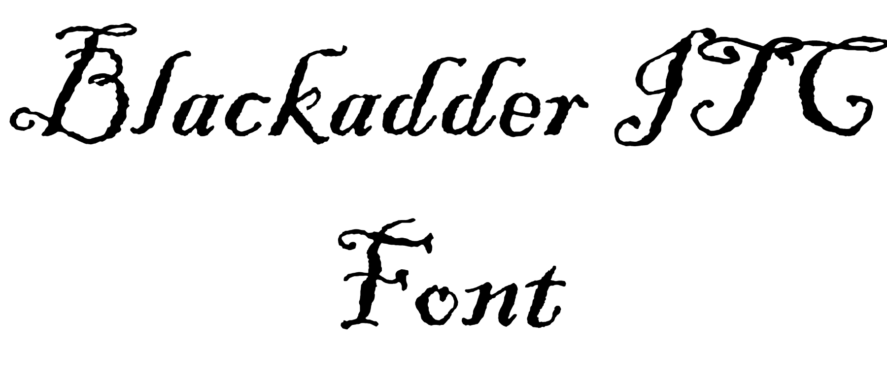
Note the distinctive “squiggles,” which serve mainly to confuse the reader, perhaps mimicking the steps taken by snakes while stalking their prey. An obvious application for this font is when writing to a herpetologist. “Dear Mr. Dawson: I was recently stung by a snake, and am interested in determining whether or not this particular snake is venomous. . .”
If you intend to scare the bejesus out of someone with your letter, you cannot do any better than to choose the “Chiller” font, a favorite of horror movie producers, serial killers and twelve-year-old boys attempting to frighten their younger sisters worldwide. . .
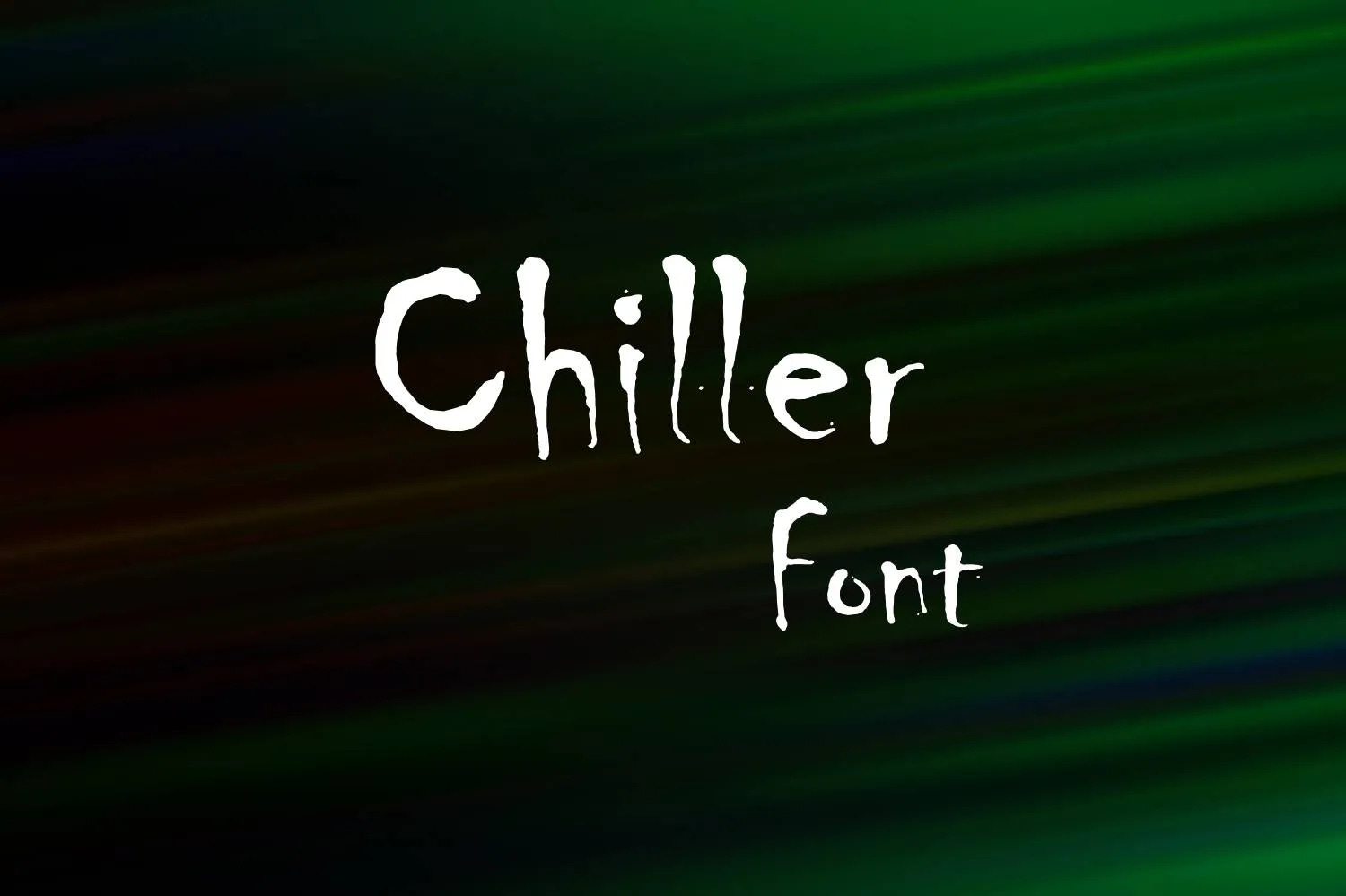
“Dear Teenage Movie Actress: The call is coming from inside the house. . .”
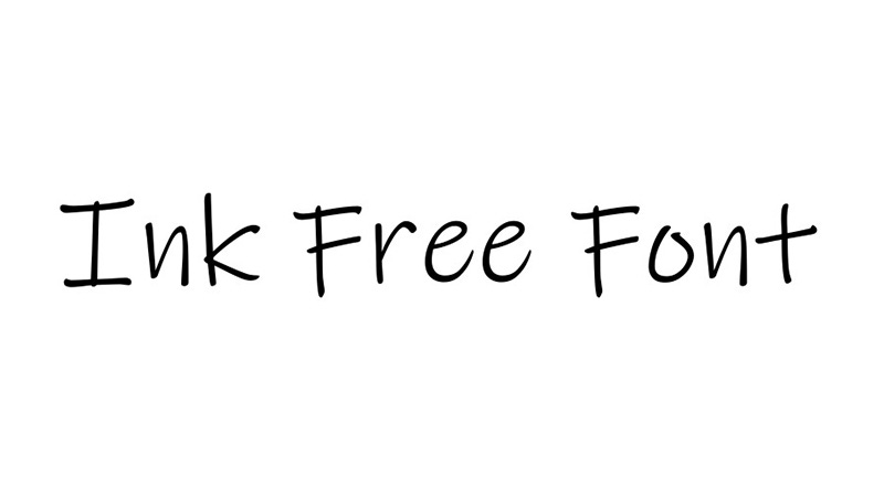
Are you looking for a breezy, casual font to inform a breezy, casual letter you intend to write? Perhaps you should consider using “Ink Free,” a font designed to make it appear as if you are scribbling a personal note to a close friend. . .
“Dear Bobby: Thanks for joining me last night at Chili’s for drinks. It was great to catch up with you - I was sorry to hear about. . .”
“Cooper Black” has been around since 1922, and has been touted as being, “for far-sighted printers with near-sighted customers.” The font was a centerpiece of the cover art for the classic 1966 Beach Boys album, Pet Sounds. . .
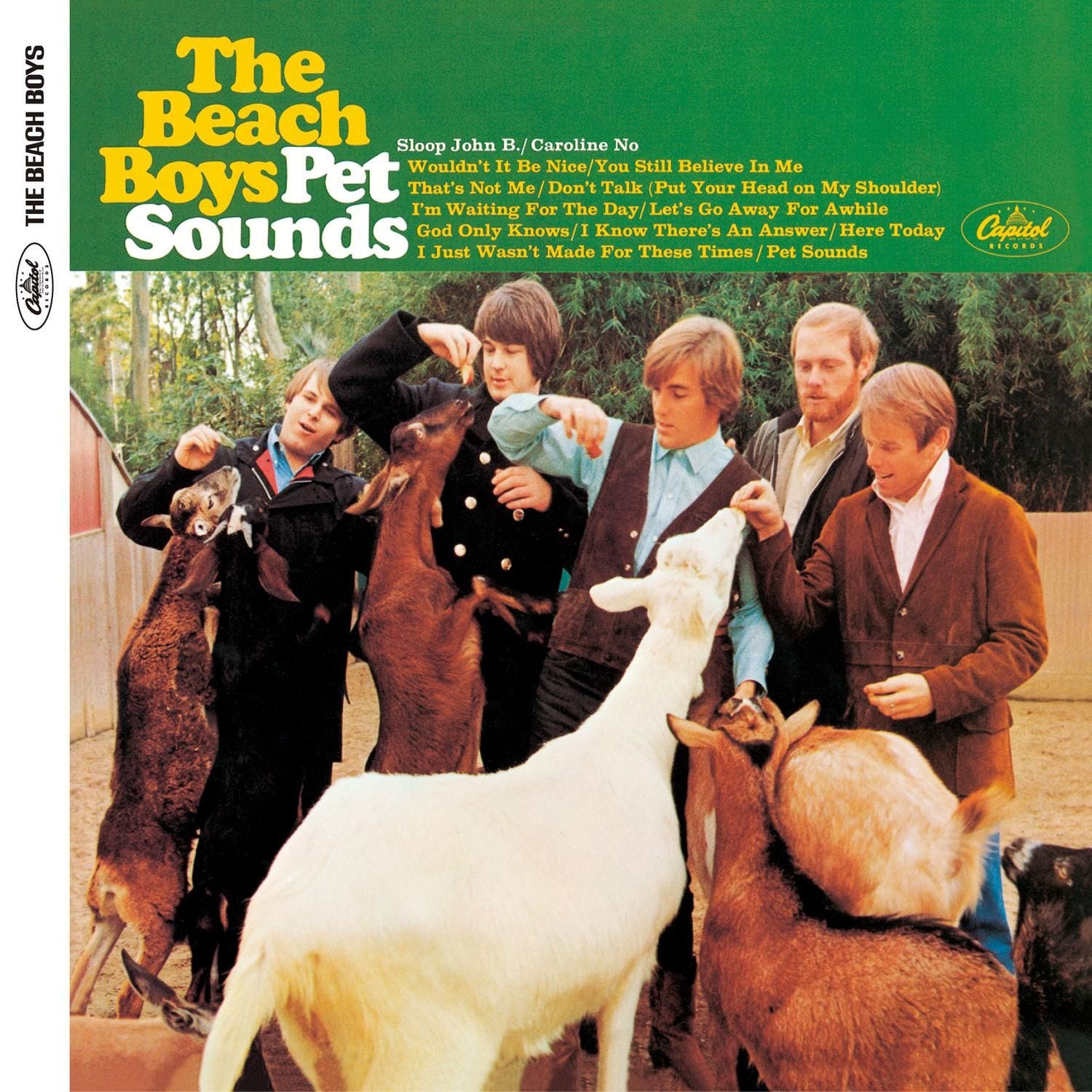
Naturally, any correspondence with Brian Wilson should feature this font. “Dear Brian Wilson: Can you recommend a great beach for surfing? My girlfriend and I would like to. . .”
Wikipedia reports that “Wingdings”. . .“is a series of ‘dingbat’ fonts that render letters as a variety of symbols.” You say it’s what, now?. . .
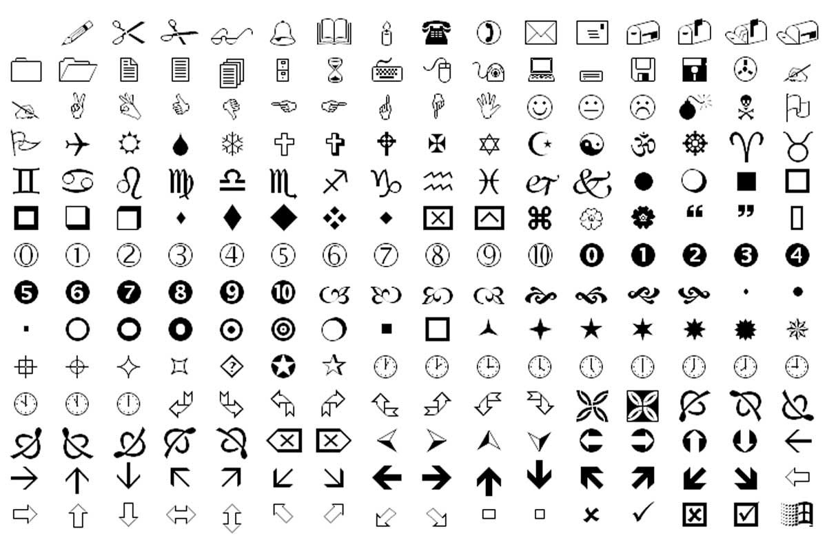
Clearly, when crafting a letter of complaint to Buffalo Wild Wings, Wingdings is the go-to font. “Dear Buffalo Wild Wings Store Manager: During our recent visit to your store, we ordered a dozen hot wings, and were unable to secure any blue cheese dipping sauce and celery to accompany them. This lack of necessary. . .”
If communicating with long-dead Egyptian pharaohs is on your to-do list, then there can be no better solution for you than the “Papyrus” font. . .
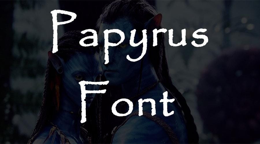
“Dear Mr. Tutankhamen: I recently viewed your tomb during an exhibition at Chicago’s Field Museum, and was impressed with the workmanship of. . .”
Another very old font for your consideration is “Old English,” useful in composing letters to lords and ladies in England, or perhaps to an “Old Englishman” such as William Shakespeare. It would feel more authentic to me if it were named “Olde English” - that extraneous “e” provides that pretentious boost oftentimes associated with English things. . .
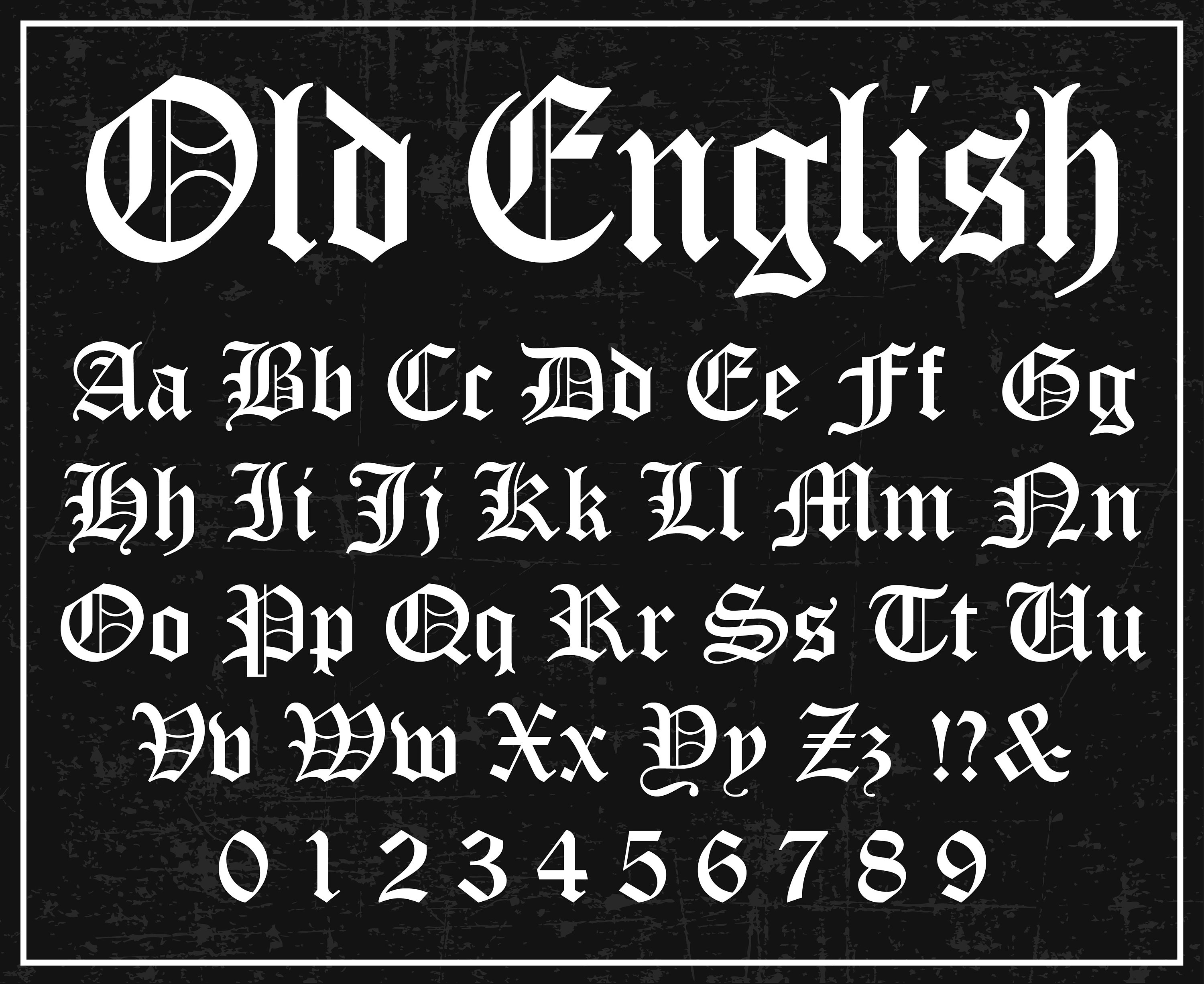
“Dear Mr. Shakespeare: Having seen a performance of Hamlet not too long ago, I am curious about Hamlet’s line regarding. . .”
As you can see, the opportunities to customize your messages are limitless; there are likely many more fonts that exist, in addition to the 229 options Microsoft Word makes available to me.
Selfishly, Rule of Three wonders what font is most appropriate when communicating with its most important constituency: its valued subscribers. Having conducted extensive research, it seems as if the right choice might be:
“Dear Valued Rule of Three Subscriber: We here at Rule of Three truly value your readership, and encourage you to embrace three simple rules, designed to enable you to live a rich, contented and full life, including. . .”
In order to ensure a steady stream of Rule of Three, in whatever typeface in which it is packaged, all you have to do is to simply type your email address below - it's free, man! Unless you choose to join Rule of Three in its extremely modest (and, overly complicated) effort to make a difference, by supporting the nonprofit organization of your choice (Note: After completing your subscription, please email us at: ruleofthreebs@gmail.com, indicating the name of the organization to which you wish to contribute, and a website address for them).
forget fonts, let's all learn to print manually again. with lined paper please
Bill,
Another solid column. This brings back memories of meetings, actually a series of meetings, to determine which font to use for our “user manual” “promotional pieces” “spec sheets” as there is a font for each topic and purpose, so I was told.
I am replying two days after your font post. I replied two weeks later on the monkeys column. You wrote the monkeys column two and a half years later, but I digress.
Please convert to The Three font for all your work. Till next week